FedEx
Pilot Day-of-Ops App

Genesis
As our company’s first foray into the airline space, there was a steep learning curve for
everyone. I was one of two designers on the team. Our first priority: gain
a deep understanding of the concepts and vernacular used by pilots, and develop a prioritized list of
functional areas that needed to be addressed.
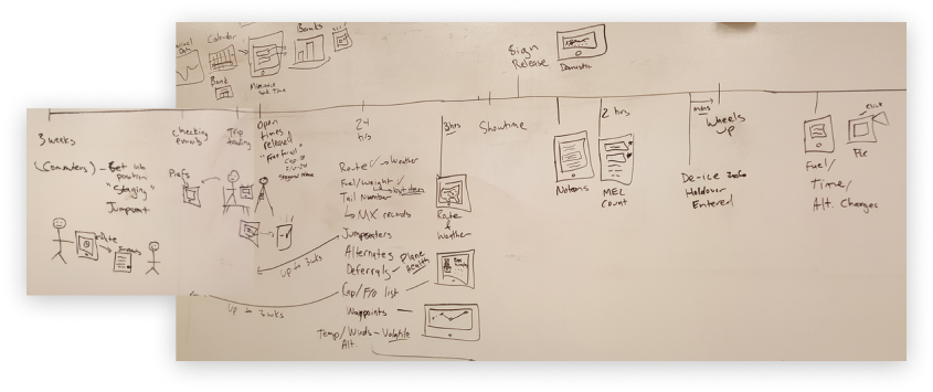
A not insignificant day-in-the-life of a pilot on a single trip

Point of Entry
Once we had a handle on the situation at large, determining where to spend the effort initially was not a
trivial task. Every stakeholder had a different view into what was important, laden with their
own unspoken biases and hidden agendas. The solution was to get all the stakeholders in a room,
cutting across internal divisions and silos, and use prioritization exercises to help them all come to a
consensus. My role was facilitator for the discussion.
Fail fast
Since nobody on the team was a pilot, we knew we’d need a steady stream of pilots for
feedback. So we involved them from the start, using a combination of cooperative and
presumptive design techniques: cooperative when we were on site and presumptive when we
weren’t. With two designers on the team we decided to jumpstart the process by each creating
our own separate wireframe prototypes, and seeing which one resonated strongest with the
pilots. It turns out we were both right (and wrong), so we pulled the strongest concepts from
both designs into what would become the final product design.
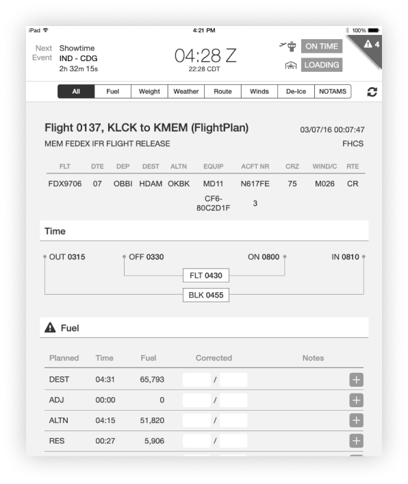
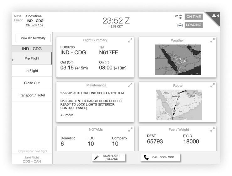
Competing presumptive designs were used to jumpstart the user feedback sessions
Medium fidelity for the win
Pilots are a very particular bunch, always picking apart the details. It makes sense, lives
are literally on the line everytime they’re on the clock. For us, this meant every piece of
data in the prototype had to be real, if we made something up they’d inevitably call us out on it, and
we’d lose valuable time explaning why the data is fake. It also meant low fidelity prototypes
were to sparse for good feedback, and high fidelity prototypes are too slow to iterate
on. Using medium fidelity, while more detail than we wanted, was the minimum amount of detail
needed to get proper feedback from the pilots. We tested with 2 - 3 pilots per week for
months on end.

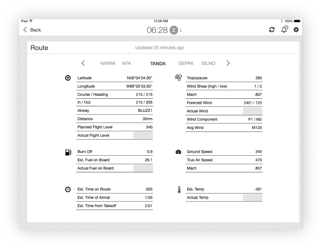
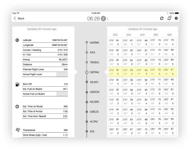
Its not the level of detail we wanted, its the level of detail we needed
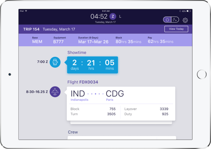
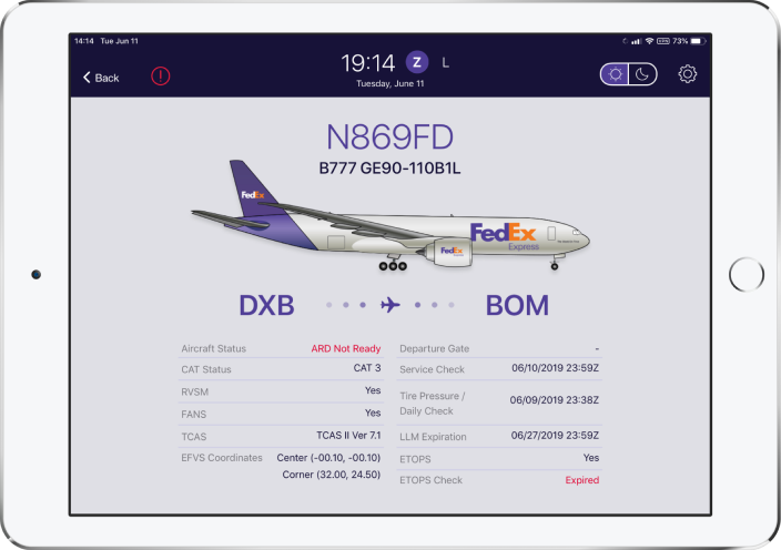
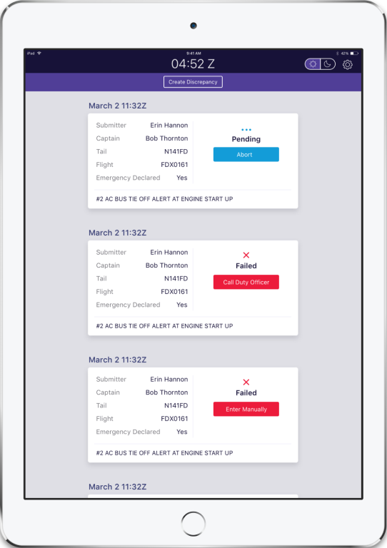
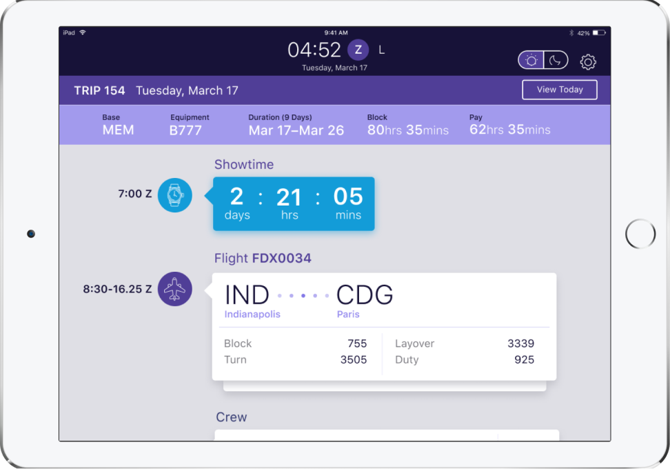
Bring on the eye candy
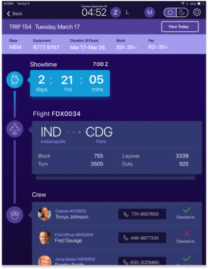
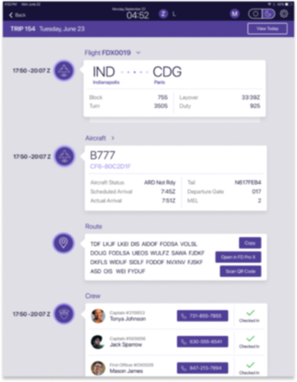

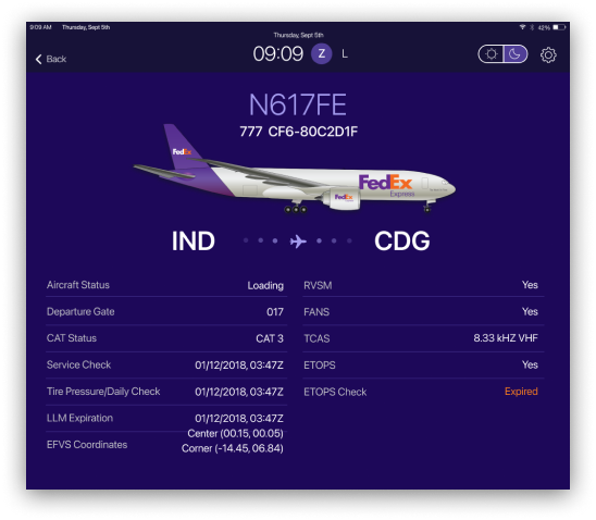
Once we had enough of the design validated we brought on a visual designer to help speed up the high
fidelity versions. We continued to user test with pilots every week. Adding color was
not trivial: too dark and errors wouldn’t stand out, too bright and they would be a distraction
to a pilot at night.
All’s well that ends well
Hardly. Challenges integrating with the backend systems were relentless. Developing a
mobile app on top of legacy mainframe systems was a constant struggle. Older systems just aren’t
designed to deliver data in tiny chunks that are needed to make a mobile app responsive. This
friction led to design changes that were necessary compromises to make the app work. Eventually an entire
middleware layer was developed to cache data from the dozen backend systems to chunk it and deliver it as
needed to the mobile app. Once that was completed, system performance and stability rose to meet
the expectations of the pilots and adoption increased dramatically.
