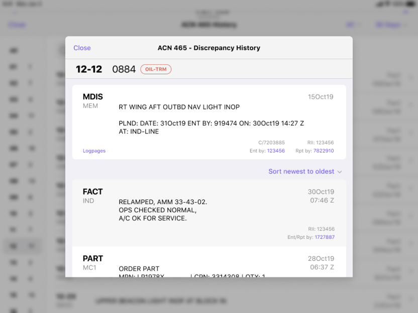
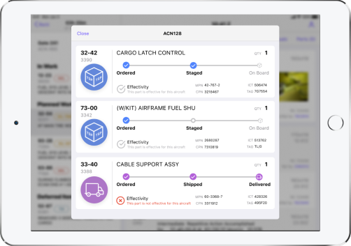
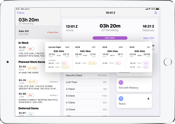
FedEx
AMT App
AMT App


A project like no other
A few years after deploying our pilot app, FedEx was so happy with the result they invited us back to
create an app for a new class of users, and with all new problems to solve. Sure, airline
mechanics have a slightly different vernacular, and their level of tech savvy was decided lower than the
pilots, but the real challenge with this project is how they wanted to run it. FedEx learned,
like most of our clients who’ve never done a mobile app do, that creating the app is only part of
it. Supporting the yearly iOS updates and making feature enhancements is a real problem for
them: they have no expertise to do it so they had to rely on a support contract with
us. For this project, they wanted to address that problem by starting with the end in
mind. They wanted to provide an entire team of their own and have us teach them how to do
mobile design and development and the Agile methodology, on the live project! I love a good
challenge, so I was all in.

They wanted to provide an entire team of their own and have us teach them how to do mobile design,
development and the Agile methodology, on the live project!
The breakdown
This was a 6 month project to design and develop a mobile app for airline mechanics, while simultaneously
teaching a client-supplied team mobile design, development, and Agile methodologies, which they had
exactly zero experience with.
My role
On this project I was the lead designer, and was partnered with a visual designer. We worked
hand-in-hand from the start and collaborated on the educational curriculum. I managed the UX
parts (wires, research, validation, as well as facilitating the workshops with stakeholders and
users). The visual designer helped with wires and lead the visual design curriculum, and took
care of all high fidelity artifacts.
Where to even begin
It might have been easier if they had at least supplied “designers” of any kind. But they
didn’t have any, so they volunteered up a front-end web developer and a business
analyst. Neither of whom had any design experience or training of any kind. Our
first task began a month before the project kickoff: we had to create an entire design curriculum from
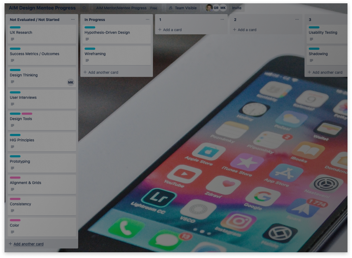
scratch! We created cards in Trello to track each design student’s progress. Each card was
a teachable unit of design, complete with its own grading rubric. The columns were
organized according to the rubric, so that we could move the cards depending on how they
did. This gave the stakeholders instant visibility into how their team was doing.
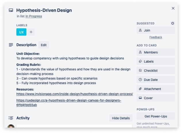
A single design unit, complete with grading rubric and external resources
These are the units that we are working on this week
Backlog of units, color coded for UX (blue) or UI (pink)
These are the units that have been completed and scored
A Trello board was used to track student’s progress




For the design students, we created a short design test for them so we could get a baseline of their
skills. This helped us understand where to start the curriculum for each student.
The kickoff
Getting consensus on the success metrics of a project has always been a cornerstone of my
process. If stakeholders can’t agree on what they are hoping to acheive, how will they know if
they’ve succeeded? I use exercises like Speedboat (or “Airplane” in this case), Survivor, and
one I call Move the Needle, to help them crystallize the metrics by which the project will be judged.

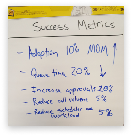
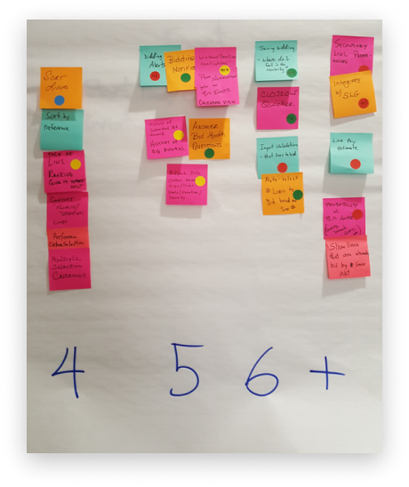
Pro tip: The key is to make sure they put quantifiable numbers on everything.
Research
Core research started in earnest. As the lead designer, I opted to start with a group round table
discussion with 8 AMTs so I could get a pulse on the scope of the pain points they have with the current
solution, what vernacular they use, and to understand the group dynamic between them. It was
important for me to identify any individuals who were particularly strong supporters or detractors of the
effort.
Design Principles
Since our work was going to be quickly carried on by another set of designers, we wanted to create some
guiding design principles. Using the information we gathered in the group session and
workshops, we came up with three guiding principles for the design of the app.
DESIGN FOR SIMPLICITY
Simplicity increases speed
BUILD TRUST
“My company provides tools that work for me”
DESIGN FOR OUTCOMES, NOT SOLUTIONS
There are multiple solutions for a problem, but only a subset of those deliver positive business
outcomes and increase employee happiness and satisfaction
AMT Day in the Life
We followed up the group session with more focused sessions with 2 or 3 AMTs + their
managers. From here we formed a highly detailed map of their day. At every step we
reviewed the findings with the new design students, to help them understand the ‘why’ behind the process.
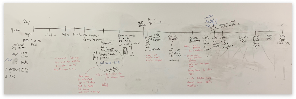
The AMT’s day was just as complicated as the pilot’s
Design and Feedback
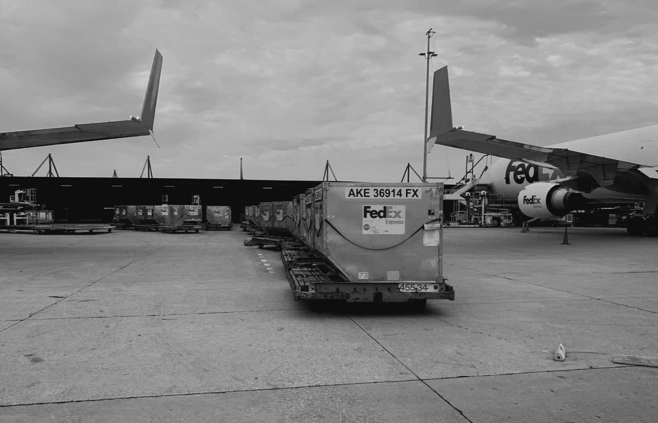
After multiple user research sessions and several trips to the ramp*
we were ready to start creating mockups for direct AMT feedback. We didn’t start with a
presumptive design because I had concerns that our design students probably haven’t learned how to “let
go” of a design yet, something designers early in their career often struggle with.
* ”Ramp” is the AMT vernacular for the tarmac
Mockups and feedback
From here things followed a pretty typical trajectory, creating wireframe prototypes and getting AMT
feedback on them using usability testing techniques.

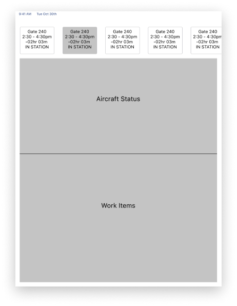
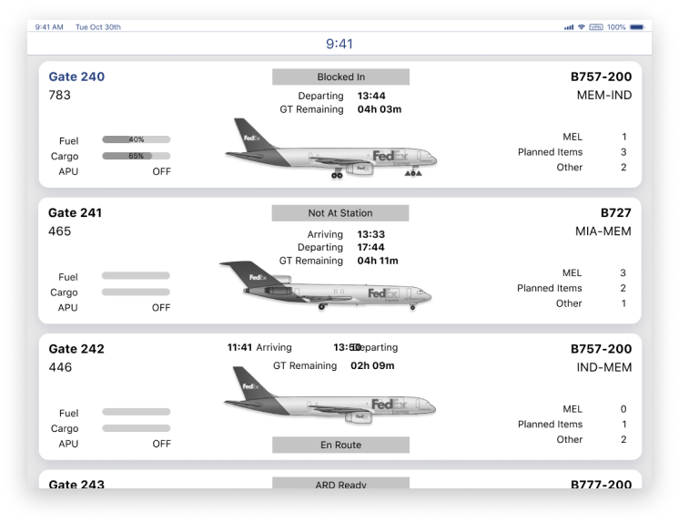

One thing that helped us a TON was switching from Sketch to Figma. Being able to conduct
on-device remote user sessions with AMTs all over the world was a game changer.
OTJ Mentoring
Parallel to designing and validating our solution, we also had to mentor and validate the student’s
learnings. Initially, they were too inexperienced to design a practical solution, so we’d carve
off bite size chunks for them to work on. We’d create our own solution as well, in case they
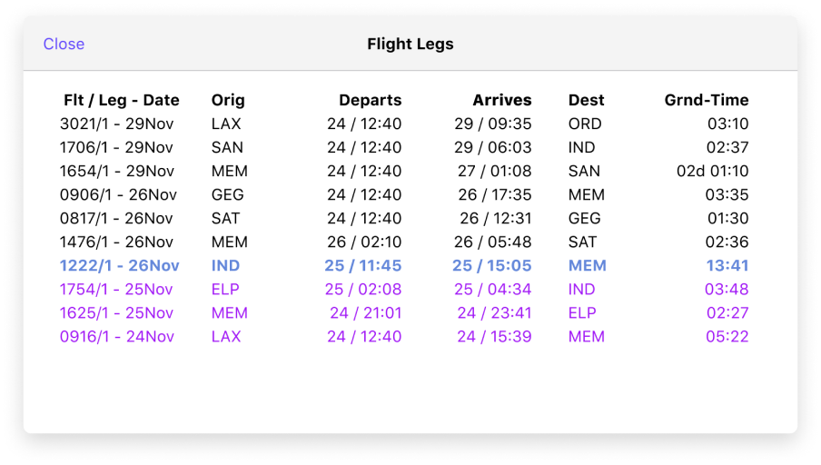
struggled to finish one before the devs were ready for it. We would then walk the students through a
redesign, taking what they had come up, layering on the design principles, and saving each as a new frame so
they could visually see each design principle represented in a linear flow from start to finish.



Hard conversations
After a couple of months it became obvious that one of the two students was not learning design at a
reasonable pace. As the lead designer it was my job, along with the PO, to have the conversation
with the client about it. We couldn’t change anything, but transparency was
important. It was a tough but important lesson learned: because the student was still doing their
“day job” as a business analyst while trying to learn design, they were constantly reinforcing bad
behaviors, such as believing that they knew the “right” way to do something because of their tenure.
Early exit
Due to budget and internal political contraints, the project had to be wrapped up a month
early. The entire project lasted 5 months. The app was completed and functioning as
expected, however, the shortened time frame meant we didn’t have the opportunity to validate some of the
larger success metrics. There was also some concern that the team we trained up wouldn’t be able
to successfully take over the project. I did follow up with the students for a few months after,
and even checked up on their progress in the Figma file. I was pleasantly surprised to see some
new features and exceptionally well-balanced designs! The whole experience was so transformative
for me that I now mentor other designers in my spare time at DesignLab.
